
SharpX NextGen Financial Reports
Data Visualisation | User Experience | Design System
18 Months (2021-22)
Client Project under IBM
Design Problem: Heineken's financial reporting interfaces on SAP Analytics Cloud (SAC) faced usability and scalability challenges, lacking a cohesive design system.
Solution: The project redesigned over 35+ financial reports with enhanced data visualization and KPI dashboards, ensuring consistency with Heineken’s brand guidelines. This improved clarity and usability, earning the team the Insights and Enablement Certificate of Appreciation for their impactful contributions.
Heineken
This project began with a user-first approach—understanding Heineken's users to design a system that meets their needs.
18+ Months
35+ Reports
10+ Operating Companies
8+ Team Size
Current Landscape
Heineken, as a global brewing leader, manages a vast network of operating companies (OpCos) across different regions. Each OpCo maintained its own financial reporting system, tailored to its specific needs, resulting in a lack of standardization.
This resulted in:
Constraints of Existing Tools
Fragmented Reporting Across OpCos
Overwhelming Financial Data
Usability and Accessibility Gaps
Limited Actionability
Challenges in Collaboration and Transparency
Design Methodology
Our expertise in financial reporting was constantly updated, allowing us to quickly familiarize ourselves with SAP Analytics Cloud (SAC) and the specific financial requirements of each track. Armed with a wealth of information, we adopted a dual approach—using divergent thinking to deeply explore financial reports and uncover opportunities, followed by convergent thinking to take focused, strategic actions.

Discover: Gathering Data
Research Objectives and Questions
-
Usage Patterns: Which reports are used most frequently, and for what purpose?
-
Navigation and Interaction: How do users navigate through the reports, and what challenges do they face?
-
Customization Needs: What components or filters do users require to tailor reports to their needs?
-
Actionability: What insights or actions do users expect to derive from the reports?
-
Accessibility: How do users interact with reports across devices, and what improvements are needed?
Collaboration with Stakeholder
Conducted interviews with users (Finance and Business Teams, Project Managers) and multiple working sessions. While also collaborated with SAC developers to understand technical capabilities.

Define: Filtering Data
Problem Identification
-
Inconsistent Filters
-
Lack of Comparability
-
Mobile Scalability Issues
-
Overwhelming Data Presentation
-
Lack of Actionable Elements

Primary Feature Set

Feature Prioritization
To effectively address these challenges, we developed a roadmap for feature prioritization. This involved balancing user needs, business goals, and technical feasibility.
KPI Visualization
Standardized Filters & Benchmarks
Actionable Insights
Enhanced Data Visualizations

Develop: Design Ideation


User Flow
A key example here is the Gross Margin Report, where the flow captured every user step, from accessing the report to analyzing data and taking action. We visualized all layers of the reports, including static elements (e.g., tables, and headings) and interactive components (e.g., clickable KPI tiles, filters, and graphs).
Continuous user feedback and testing ensured that the designs met the diverse needs of Heineken’s user base while aligning with SAP Analytics Cloud (SAC) capabilities.
Evolution of Screens: Wireframes
The initial wireframe, based on research insights, introduced maps, benchmarking tools, and report summaries to address user needs.
User testing and developer feedback enhanced interactivity, navigation, and usability, resulting in intuitive, scalable wireframes tailored to Heineken’s needs.


Deliver: Design System
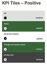
Heineken’s Design System
The comprehensive design system ensured a consistent user experience across all financial reports while remaining flexible to diverse reporting needs. It unified visual and functional elements, aligned with Heineken’s brand identity, and fully leveraged SAP Analytics Cloud (SAC) capabilities for seamless integration and optimal performance.


Benefits of the Design System


Impact of the Deliverables
The redesigned financial reporting system brought significant improvements to Heineken’s operations and user experience:
Customizable Filter Panel
Enabled users to tailor data views with ease, improving efficiency through advanced filtering options.
Intuitive Navigation
Tabs allowed seamless switching between views and further classification of content, enhancing usability.
Interactive Elements
Integrated clickable text across tables, KPI tiles, and graphs to provide easy access to in-depth analysis pages.
Enhanced Data Visualization
Improved clarity and usability through the integration of graphs, waterfall charts, and dynamic visualizations.
Actionable KPI Tiles
Provided at-a-glance insights with color-coded performance indicators and clickable bars for detailed analysis, helping users prioritize critical areas.
Unified Reporting
Design System
Delivered a comprehensive design system ensuring consistency across all financial reports, while adhering to Heineken’s brand guidelines and leveraging SAP Analytics Cloud (SAC) capabilities.
Scalability and Flexibility
Redesigned over 35 financial reports across nine tracks with a system that supports future modifications and responsive designs optimized for desktop and mobile.
Reduced Cognitive Load
Streamlined content presentation and interactive features reduced user effort, making reports intuitive and actionable while expanding SAC’s technical possibilities.